Ever wondered what makes a web design truly effective in capturing and retaining user attention? In this blog post, I sit down with our Associate Creative Director, Bradley Hale, as he offers insights into color selection, font pairing, layout principles, and more. Whether you're a seasoned designer or just starting, Bradley's expertise will guide you toward crafting a standout web presence.
1. Hi Bradley! Thank you for joining me. Can you start by telling us about your role as the Associate Creative Director at 2TON?
I’ve been a part of the team for just over 10 years now, which blows my mind – but I’m still here and lovin’ it. Essentially, I direct and create compelling, effective and strategically aligned creative work. I specialize in UI and website design, so most of my projects are focused around that, but I touch branding and advertising projects as well.
2. How do you select an impactful color palette for web design?
We typically start with a brand’s existing color palette from their guideline documents, but we selectively enhance it by adding variations or shades based on our specific needs. Our goal is to let the content shine, using brand colors to enhance content or draw attention to certain actions we want users to take.
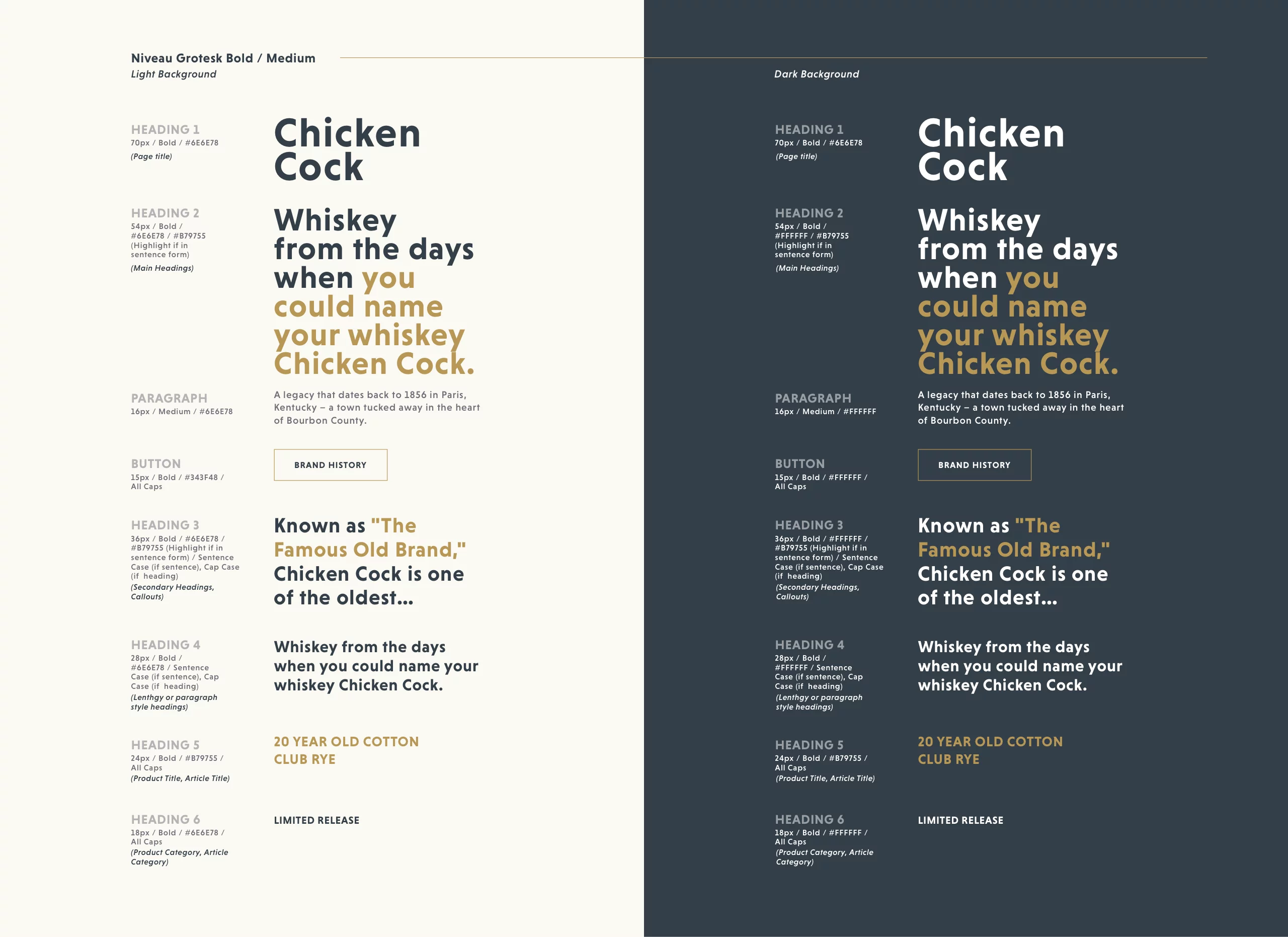
For important buttons or headlines, we opt for bold color selections, while using more subtle color choices for background elements or large areas to separate sections. We also prioritize color contrast when placing text on backgrounds to ensure readability remains high.
3. Can you share your favorite strategies for choosing and pairing fonts to enhance readability and aesthetics?
Aside from color choices, such as placing black text on a white background to ensure maximum contrast, another way to maximize readability is by choosing fonts that are clean, clear, and scale well. Web fonts will be seen on many different devices and screen resolutions, so having fonts that work as large headlines as well as smaller paragraph text, and everything in between, makes our jobs easier. That being said, we also want the font to fit the brand’s character. So, we can be playful, sleek, traditional, modern, geometric, whatever suits the brand the best, without sacrificing readability.
4. What are your go-to principles for creating a visually appealing and user-friendly web layout?
Whether I am designing a mobile, tablet, or desktop layout, I am always thinking about how content will shift and scale to different device sizes. This process is called “responsive” or “fluid”, depending on the approach you take. Both ensure that buttons, typography, images, etc will be sized appropriately for different devices, and UI elements and the way you navigate around a website may change based on your device.
5. How do you ensure that your designs are both creative and functional across different devices and screen sizes?
In addition to my last answer, we can use creative ways of navigating and interacting with content, based on the device. On mobile, we can bake in touch and swipe interactions, while displaying the least amount of content, as large as the device allows, at a time. While on a desktop website, we have a lot more real estate to work with, so we can have more detailed and complex layouts, showing several different types of content at a time. The mouse cursor also allows for more precise clicking, so we don’t necessarily need giant, finger sized buttons.
6. How do you use color to create a specific mood or convey a brand’s identity?
We want to ensure that the chosen colors are used consistently across all brand materials, including the logo, website, packaging, and marketing materials. Consistency reinforces brand recognition and identity. We can also use color theory to create a specific mood by focusing on either warm colors, cool colors, or neutral colors, and then selecting bold, bright colors or soft, pastel colors from the palette. Bold, bright colors will create a sense of excitement and energy, and can be used to attract attention. Soft, pastel colors can evoke a sense of calmness or relaxation.
7. Can you give us some insights on how to maintain a strong visual hierarchy on a webpage?
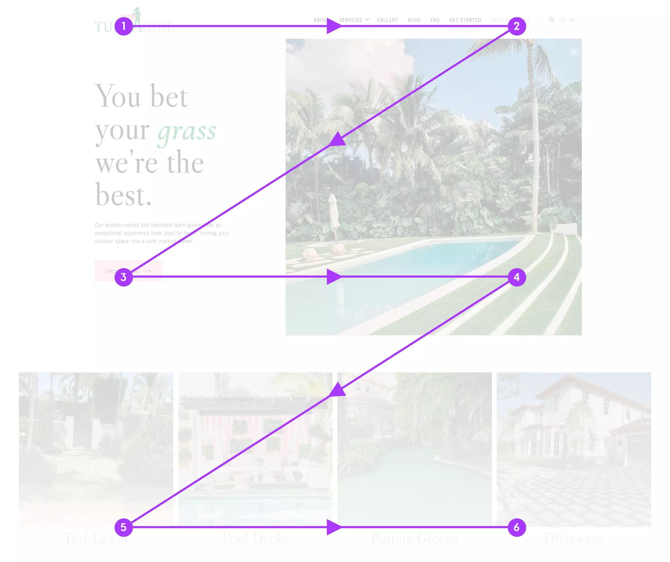
A common pattern used to lay out content on a home page or landing page is the “Z Layout”. This model dictates that core data is visible in the pre-scroll area, and specific information placed in sports of the highest visibility like top corners, then following the “Z” down the length of the page. Part of what we do to ensure the user can follow this path down the page is to not add unnecessary emphasis on elements or content that would cause the user to break this natural flow.
8. What are your best practices for incorporating user feedback into your design process?
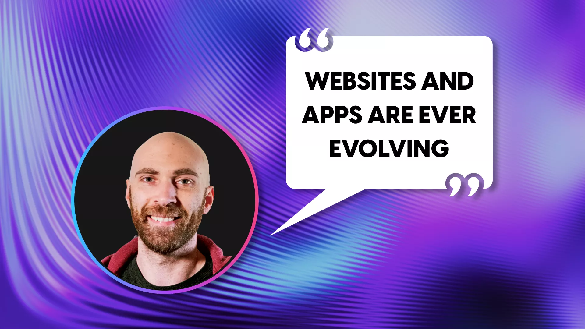
User feedback is a very important part of the ongoing design process. Websites and apps are ever evolving, so collecting feedback at different stages in the design process ensures continuous improvement. Some of the keys for success are understanding the goals of the feedback, collecting it through the chosen method, analyzing, then iterating on the design improvements.
9. Looking ahead, what web design trends or innovations are you most excited about and why?
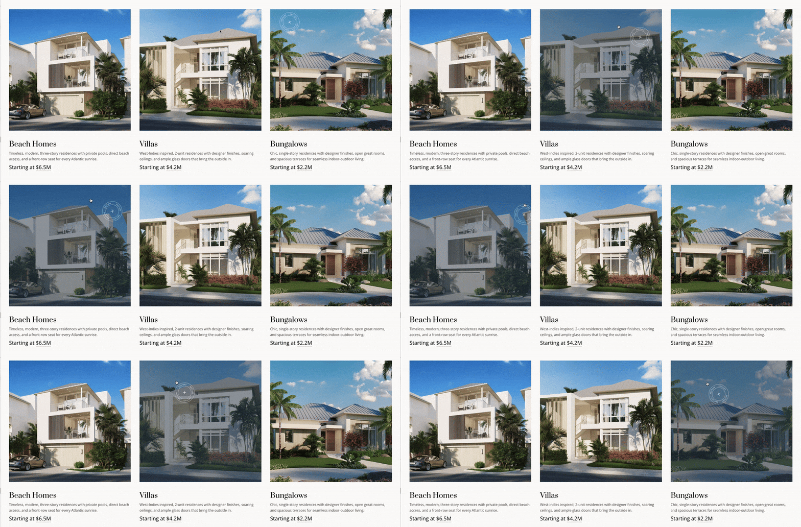
There are a few trends that we’ve been incorporating and are a lot of fun to design and build. The first are “micro-interactions”. These are exactly what they sound like, subtle interactive elements, triggered by hovering, clicking or scrolling. These make an interface feel more responsive and alive. They can guide users, improve navigation, and add a little delight to simple tasks. The second would be “advanced scroll effects”. This is when an animation is triggered by a user scroll. Smooth scroll animations, parallax effects and dynamic content transitions fall into this category. This can make the space feel more interactive, engaging and immersive.
10. Could you share a recent example of a project where you successfully applied these tips and what made it stand out?
A recent example of a website where we incorporated many of these techniques, and really brought the brand to life in the digital space is the Ouanalao (ouanalaoresort.com) website. You’ll notice the use of neutral colors and pastel shades of blue, to create the chill, relaxing environment for the residential and lifestyle photography to shine. We made use of the “Z Pattern'' as well to guide the user through the site and hierarchy of content we want to show. We also sprinkled subtle micro-interactions and scroll effects throughout the site, gently nudging users in a direction and making sure the content feels interactive.
By understanding the importance of color selection, font pairing, layout principles, and responsiveness, you can elevate your web presence and ensure it stands out in the digital landscape. Incorporating these tips into your design process will help you create websites that not only capture attention but also offer an engaging and user-friendly experience.
Looking for expert help to design your website? Let's talk.
