Tacos and design are just a couple of our favorite things here at 2TON. Combine them together and you’re basically handing us our dream come true.
All of that to say, we’ve pretty much been on cloud nine ever since Dos Amigos Tacos, the hottest new taco joint to hit the scene in Palm Beach County, asked us to help them create a brand that looks and feels as good as their food tastes.
Dos Amigos serves up fresh, high-quality ingredients in a fun, energetic, casual environment. When asked about their values, the client made a point to stress that they really wanted the brand to feel warm, fun and inviting. They’re not just a local restaurant; they’re your next-door neighbors. Because all of these unique qualities and values are ultimately what make up the brand’s foundation, 2TON sought to represent all of these attributes with Dos Amigos’ visual identity.
The bright, vibrant tones found throughout the color palette embrace their lively and welcoming persona. While the blues encourage a likeness and a human quality to the Dos Amigo brand, the bright greens serve as an homage to their scratch kitchen and fresh, high-quality, non-GMO ingredients.
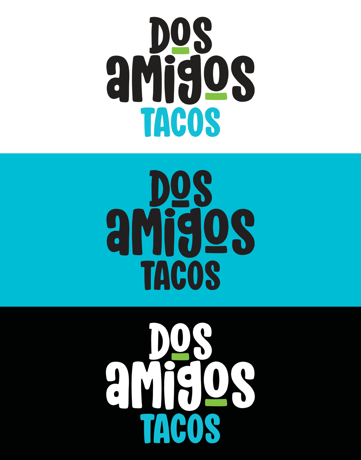
Using a rounded, handwritten typeface, we created a simple logo that felt warm and personable—as if a friend had simply written it on a post-it note. The bold underlining of the two O’s is also a very subtle metaphor of the two friends and business partners whose shared passion inspired them to bring the idea of Dos Amigos to fruition.
Dos Amigos prides itself on their unconventionality. They are not concerned about fitting into any mold, whether that be established by their type of cuisine or their fast-casual business model. They are simply and authentically themselves.
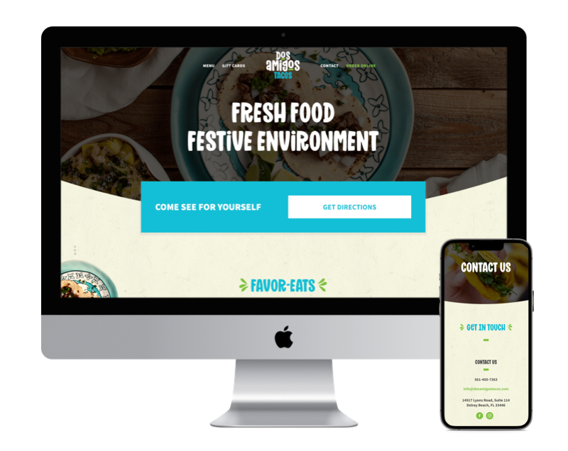
These genuine and raw elements are mirrored throughout the Dos Amigos website which are immediately evident with its centered and symmetrical navigation menu located at the top of each page. Meanwhile, the textured paper pattern used throughout the website denotes the familiar intimacy similar to that of a family recipe card that’s been passed down from generation to generation. Again, reiterating the brand’s narrative as being cozy, convenient, friendly and familiar.
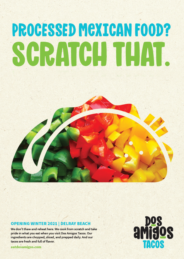
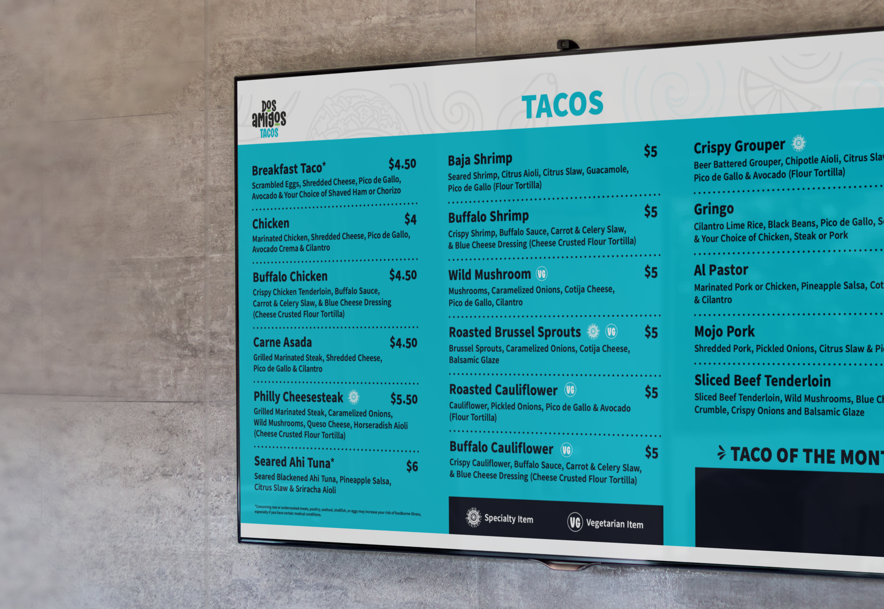
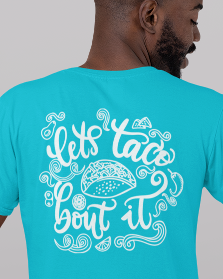
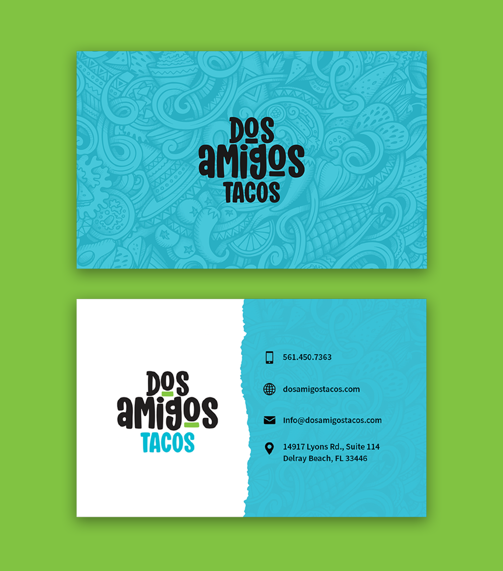
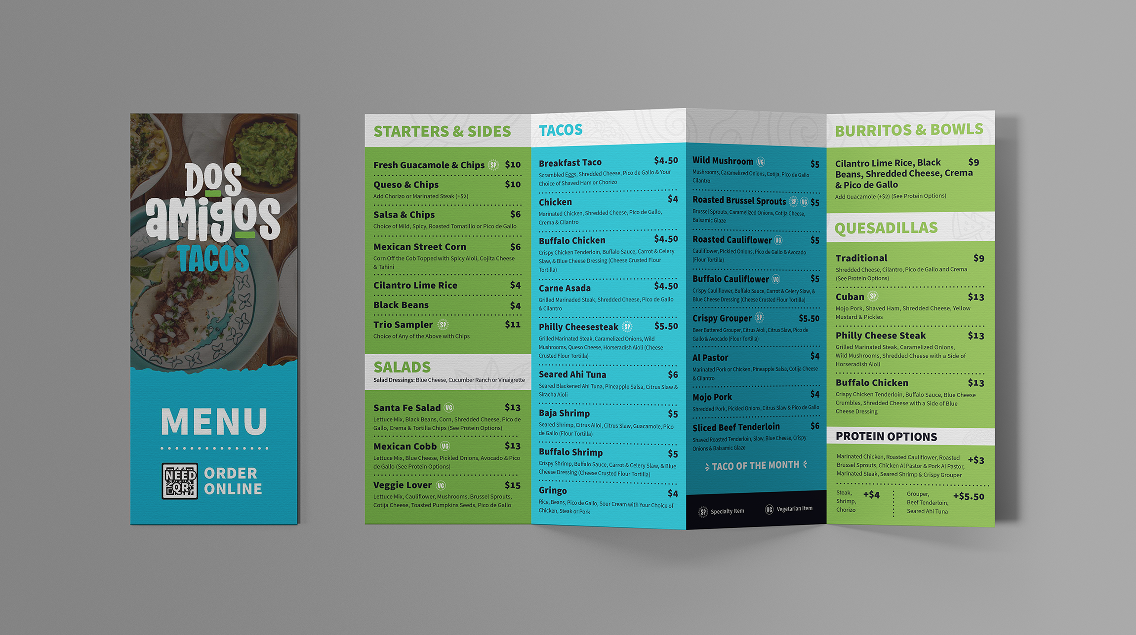
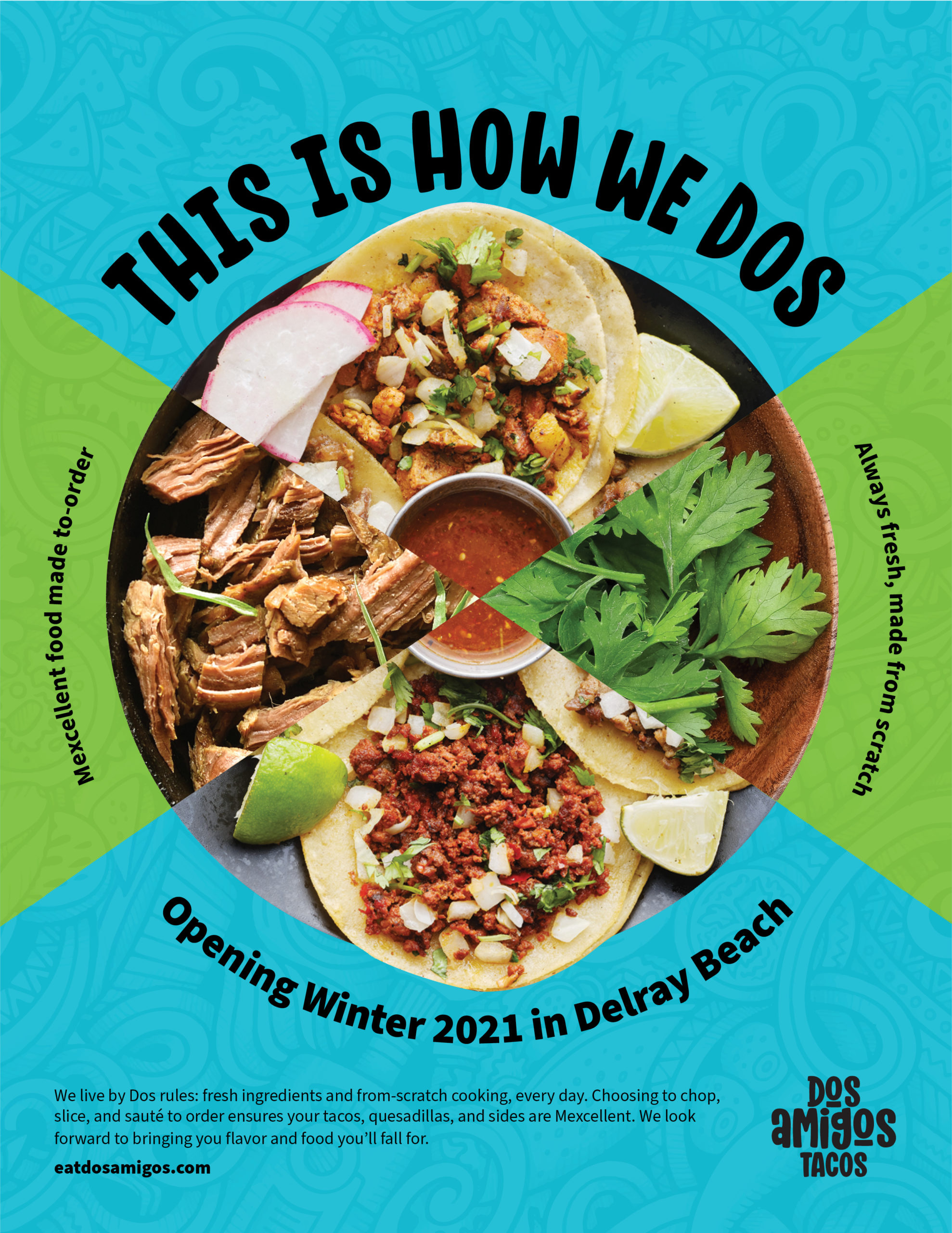
Additionally, our 2TON team developed various print pieces, including business cards, takeout menus and menu boards, and we also crafted a variety of campaign concepts that help position Dos Amigos as a healthy, fresh and made-to-order alternative to your typical fast-casual food venue.
